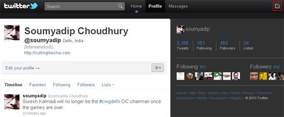
Got the new Twitter interface and took it for a drive immediately. Some have touted the new-look Twitter as a Twitter desktop client killer, I say, not yet. While, overall, it was a much better experience, but felt it still needs a little more to be able to make me go gaga. There’s much missing in there.
Here’s my top 10 wish-list for the next Twitter upgrade (will they call it the New New Twitter or #NewNewTwitter?):
1. Classic retweet: While Twitter’s inbuilt retweet feature makes retweeting fast and simple, it often kills the purpose. We usually like to add a little comment to the tweet while retweeting but Twitter doesn’t allow that natively. It still involves a copy/paste and manually inserting an RT. Too much work.
2. Expanded short URLs: Twitter led to the flood of URL shortening services but even the #NewTwitter doesn’t prevent us from getting a nasty surprise on clicking a shortened URL. If not for the numerous other URL shortening service, they could have at least done it for their very own t.co URLs. The expanded URL being shown on mouseover shouldn’t be too much of a work. Or is it? (Anyway Twitter will be a bit wary of mouseovers nowadays).
3. @replies alert: We all like to be mentioned in Tweets (unless it is someone trying to sell Viagra) and I prefer to be alerted whenever some tweet has an @soumyadip in it. The alerts need not (and should not) be in your face, but just a subtle number sitting besides the text on the mentions tab. There’s ample space to expand the tab to fit in the numbers.
4. DM alert: Yes, we know that Twitter isn’t for private chat, especially when using a third-party app. But it is also not the best way to get in touch with someone immediately even if he/she is logged on to Twitter, because the Twitter web interface doesn’t alert you about incoming messages. The email comes, but then that is a different interface all together. The DM alert can also be similar to that of the suggested @replies alert, a number besides the Messages link on the top navigation. Simple.
5. Faster embedded media preview: The new quick preview of embedded images and videos (from Twitter’s partner services) is a welcome addition but it doesn’t display on the default timeline. In this impatient age, the more you can show upfront, the better. At least the images (not necessarily the videos) could be shown within the timeline itself, somewhat like what the the open source rabr does (that I use for the Cutting the Chai Twitter client cut.tc).
6. App name in default view: The app name that shows up below the Tweets is one of the best ways to pimp your Twitter client. But in the new version Twitter doesn’t display the name (and the link) of the Twitter client used to send the Tweet by default. It only gets shown when you go to that individual tweet. Is this also an indication that Twitter gradually wants to push app developers to the oblivion? Apart from publicity purposes, the name of the app adds a little extra info to the tweet that the tweet doesn’t reveal by itself. If the user is tweeting from a mobile app, it can indicate that he/she is away from the computer and isn’t at home or at work, but somewhere out in the world, tweeting.
7. Count in tweets retweeted: A retweet, usually, is a pat on the back (also repeated kicks on the arse for stupid tweets). But the new Twitter doesn’t display on the default view how many times that tweet of yours has been retweeted. Yes, it is viewable when the tweet is, well, expanded. But as I said earlier, this is an impatient age.
8. Suggestions for search: Before Google came up with its Instant Search, we all loved Google’s suggestions for search or auto-complete (though there was also an NSFW aspect to the feature). Since we are also gradually starting to search more on Twitter search, why not have an auto-complete feature on Twitter search too? Our already tired fingers could do with a little rest. Even typing 140 characters takes some effort.
9. Bye, bye background images: The new wide layout of Twitter leaves for little space to be creative with the background image. It is after all 1040 pixels wide. This means that there is only very little space beyond to display the background image even on a 1280×1024 screen and practically none on smaller screens.
10. Omnipresent tweet box: Twitter is about tweeting. Isn’t it? I want to be able to tweet from anywhere, when logged on to Twitter. This means that I want the “What’s happening?” text box to display even on my profile and messages page. I know there’s that tiny icon on the navbar. But impatience rules.
And just in case you didn’t already know, the new Twitter also comes with a cool set of keyboard shortcuts (if only we could remember them for all the websites). You can find them here.


